BigScreen
I designed BigScreen, an iOS application for booking movie tickets which
introduced a simpler onboarding process compared to its competitors.
- Timeline
- 3 month
- Tools
- Figma,Illustrator
- Whimsical
- Usabilityhub.com
- Role
- UX Researcher
- Designer
- Themes
- User Research
- Interaction Design
- Visual Design
Intro
Booking Movie Tickets Online is Not Appealing - it takes too much time, you cannot select your seat, and your data may not be safe
While many movie ticket booking applications exist, there seems to be a lot desired from the users. Primarily these concerns can be categorized into four categories:
1. More Features: People are unhappy that the existing movie booking apps do not allow them to get more details about the movie or select their seats. This causes them to hesitate leading to them not booking movies as frequently as they would from these applications.
2. No Different Than Buying them at the Theatre: With the existing mobile ticket apps, they cannot select seats, so they have to stand in line at the theatre to get their desired seats even after booking online .
3. Lack of Privacy: Privacy of user data is important especially in today’s age. Existing apps have many privacy issues and there is a lot of skepticism about payments not being secure.
4. Complex On Boarding Process: Most people don’t want to waste time to sign up for these existing apps. They want to skip the sign up process and directly proceed with buying their tickets as it otherwise in fact takes more time than buying them in-person.
GOAL
How might we improve the current movie ticket booking experience while prioritizing speed and privacy?
Determined to change the above described scenario, I spent the next 2 months independently investigating this space and designing BigScreen - an iOS mobile app that would allow users to book tickets, read critics/user’s movie reviews, select seats and make payments in a fast and secure fashion.
KEY RESEARCH INSIGHT
The First Few Minutes of Using the App Matter
the Most to the User
I focused on front-loading my generative research in the first stage of my design process. I distributed a survey amongst 35 people and interviewed 6 potential users to gain a deep understanding of their goals and frustrations.
Doing this confirmed my observations and made me discover that the audience heavily values user-friendly designs — to the point where they determine whether to keep using an app or not within the first few minutes of the product experience. In addition to this I learned:
1. 67% of participants still use movie ticket booking applications even though the process is not fast.
2. 35% use Fandango, the most popular booking app, to book tickets
3. 25% indicating they use more than one ticket booking application which highlighted the need for an alternative.
4. 45% of participants wanted features like advance booking, notification and secure seat selection.
SYNTHESIZING OUR INSIGHTS
Defining our PersonasI then synthesized my insights into a person. This would act as reliable and realistic representations of my audience segments that I could refer to while designing thus allowing me to always keep the user in mind.
COMPETITIVE ANALYSIS
Existing Applications have Lengthy OnboardingIn my user research, I learned from users that the existing onboarding process was lengthy. Keen to not make the same mistakes with my solution, I performed a competitive analysis of Fandango, Atom, and AMC. This gave me an opportunity to experience the extensive process first hand and made me realize the direction for the MVP - simplicity.
To have my solution perform well as an MVP, simplicity would need to be adopted, and hence I prioritized ensuring there was a quick and easy onboarding experience.
INFORMATION ARCHITECTURE
Designing the FamiliarTo ensure the MVP was within scope, I crafted four user stories to aid the creation process:
1. I want to book movie ticket
2. I want to select seats
3. I want to read critic and user reviews of a movie before booking
4. I want to cancel my ticket
Log In User Flow
Ticket Booking Process

Cancel Ticket and Refund

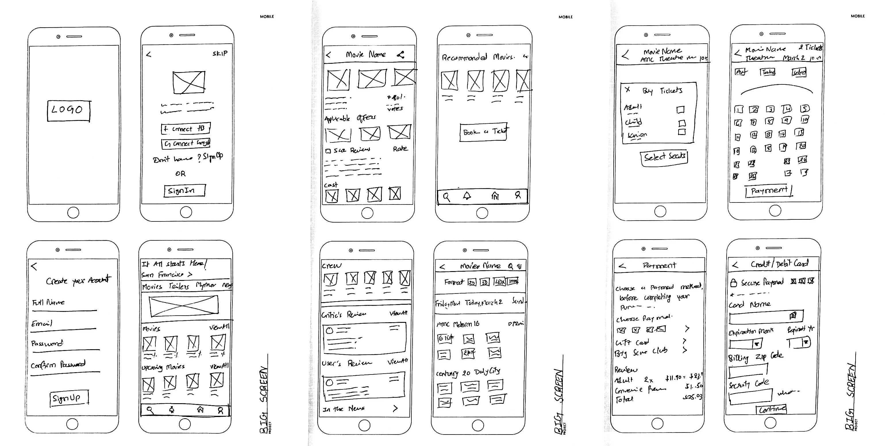
LOW FIDELITY WIREFRAMING
Bringing It All TogetherWith my user stories mapped out, I moved into the next phase of designing the app, starting with some rough sketches. I incorporated the best practices and existing design patterns to ensure the experience was user friendly and then digitized these wireframes for usability testing.


USABILITY TESTING
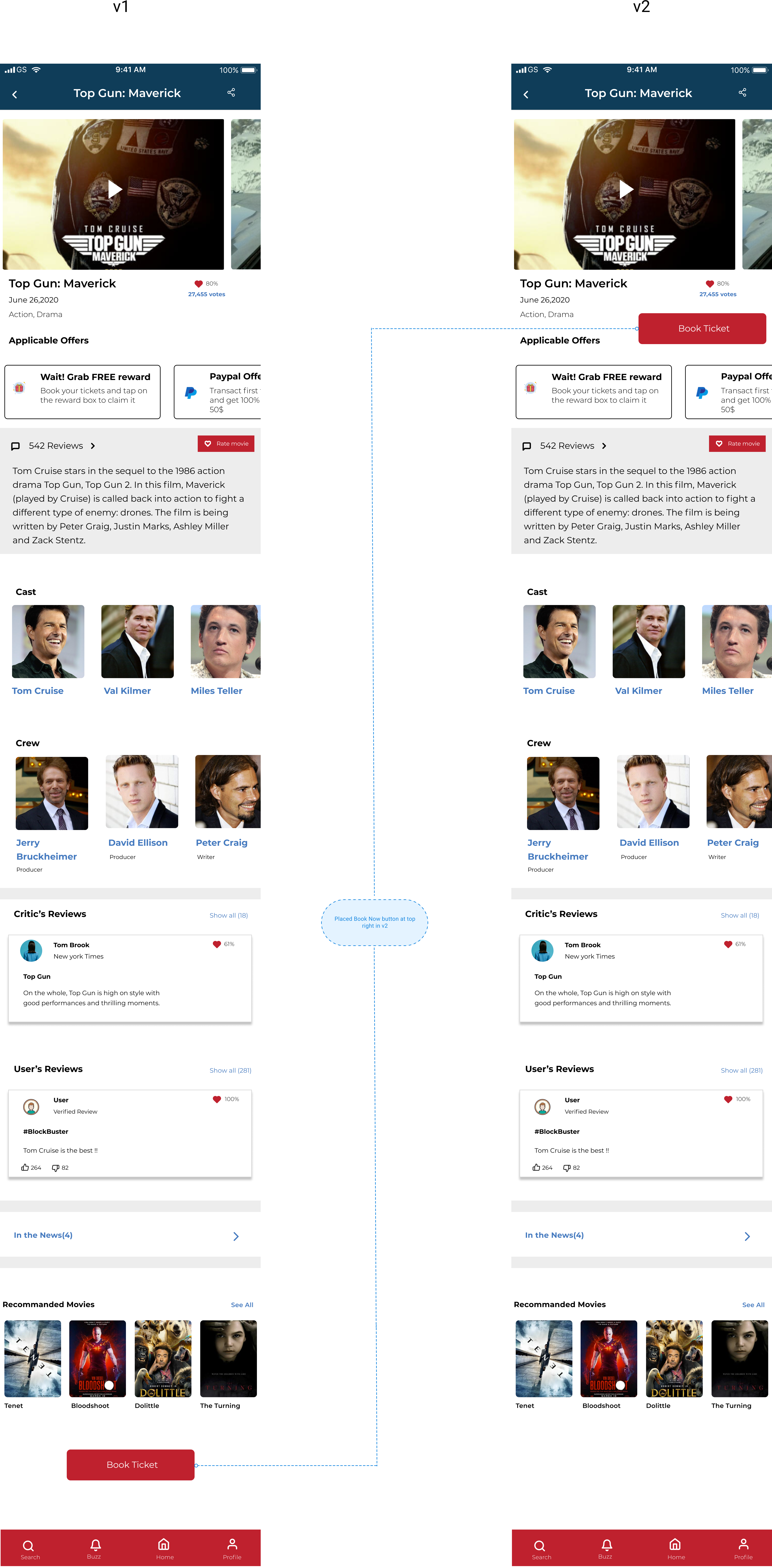
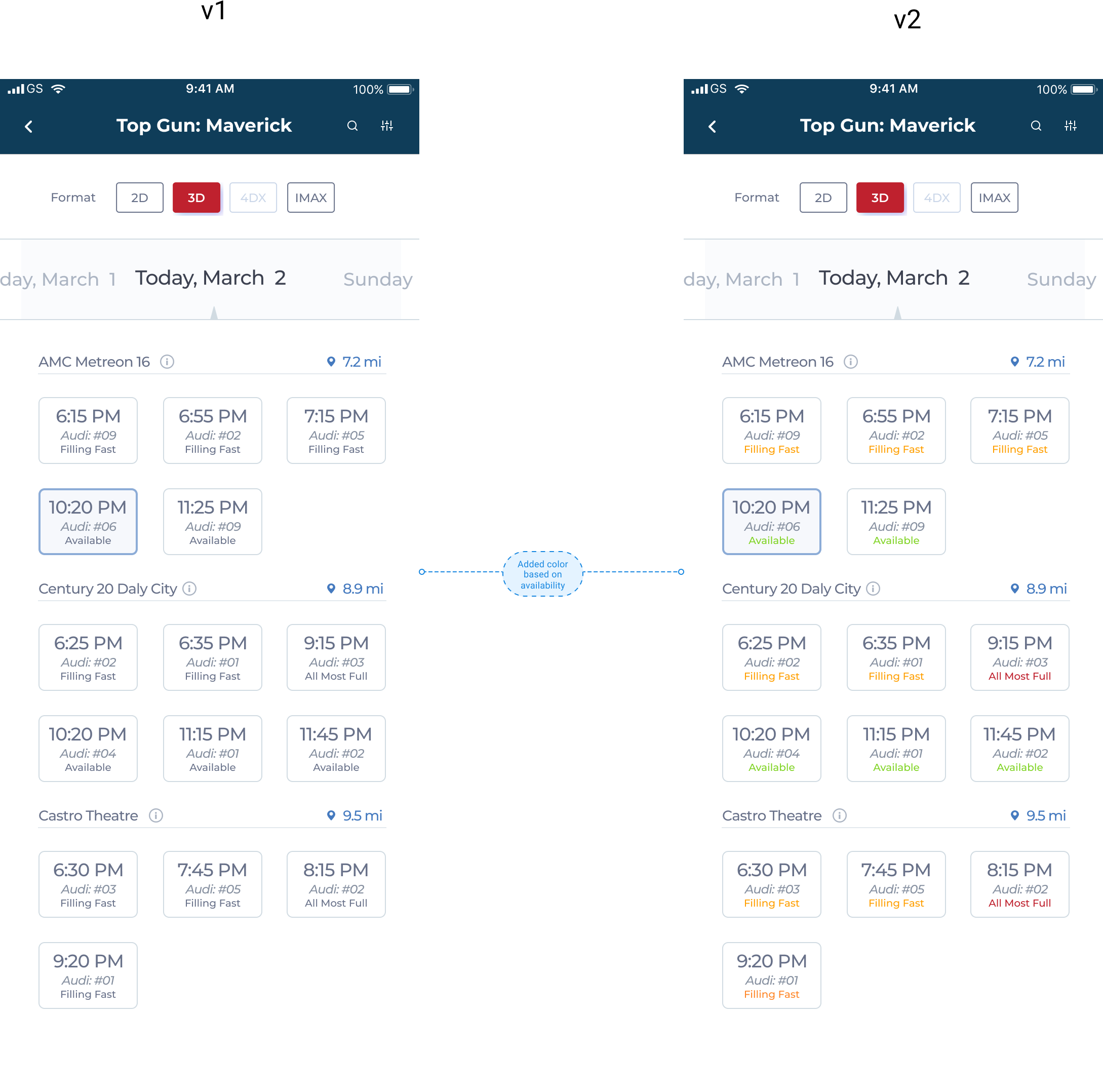
Involving the Users in the Design ProcessThe usability testing session with 3 participants was smooth, with us identifying 3 flaws. The majority of improvements made were on spacing on content and button placement, spacing inconsistencies, and text resizing.
There were two main adjustment needed:
Change #1
Users were more interested in booking tickets. They took time to find the book ticket button. As a result, I placed the book ticket button on the right hand side after the movie banner so it was the first item the user would see.
Change #2
Made theatre options visually enticing to give users an overall idea. Before testing, this was not an option. This new visual design gave the website a new attractive look.
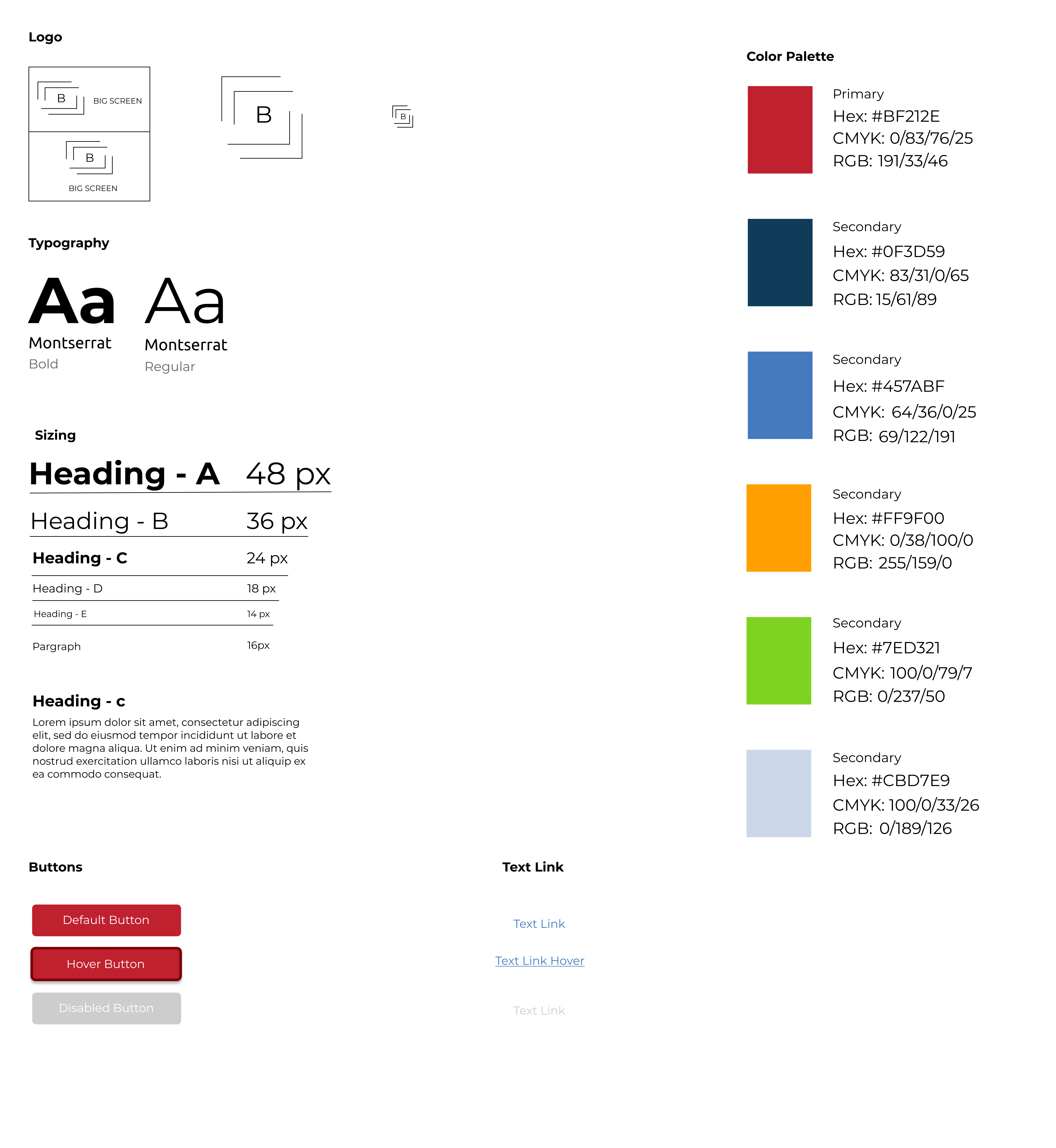
BRANDING
Introducing a Visual Style GuideTo give our app a personality, I crafted a logo and style guide which would act as a constant reference when designing the high fidelity prototype of the app itself. This would ensure visual consistency and make the app look more professional.
THE LAUNCH
Introducing BigScreen - an app that fosters fast safe movie ticket booking experiencesSo what if you are not keen to stand in line to buy a ticket? BigScreen now lowers the barrier to entry for movie ticket booking by allowing you to quickly select a movie, see it’s reviews, find a theatre, select your seat, and book your ticket. The app’s goal is to be the go-to solution for booking tickets, without you having to ever reconsider standing in line or using another app again. Below is a look at the final build.
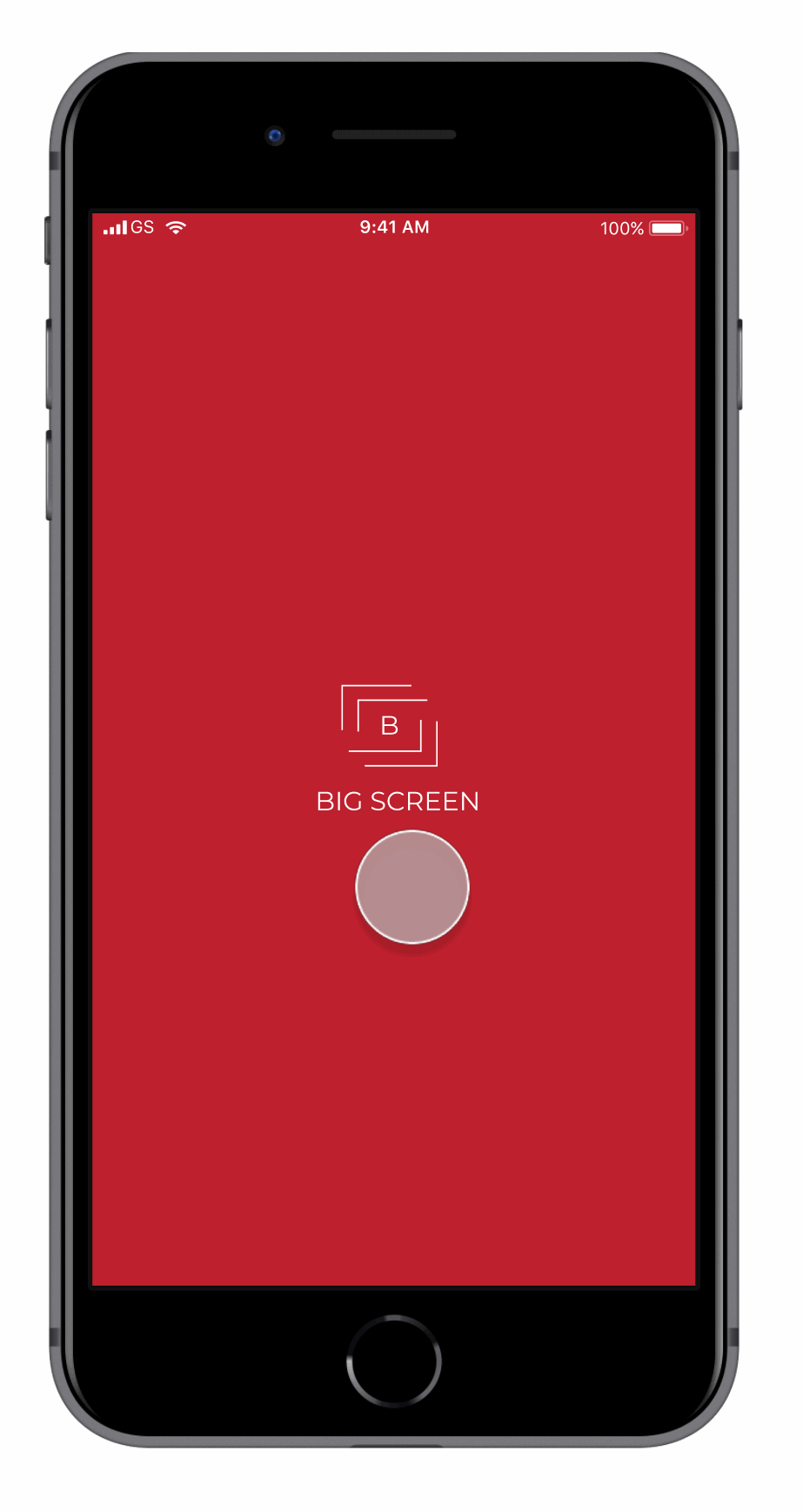
Fast Onboarding Process
Slow onboarding was a clear issue in the past. I addressed it by ensuring the signup screen was now just two screens away from home and introduced easy sign-in methods through Facebook and Google. This would now allow users to quickly get into the app and book their tickets.
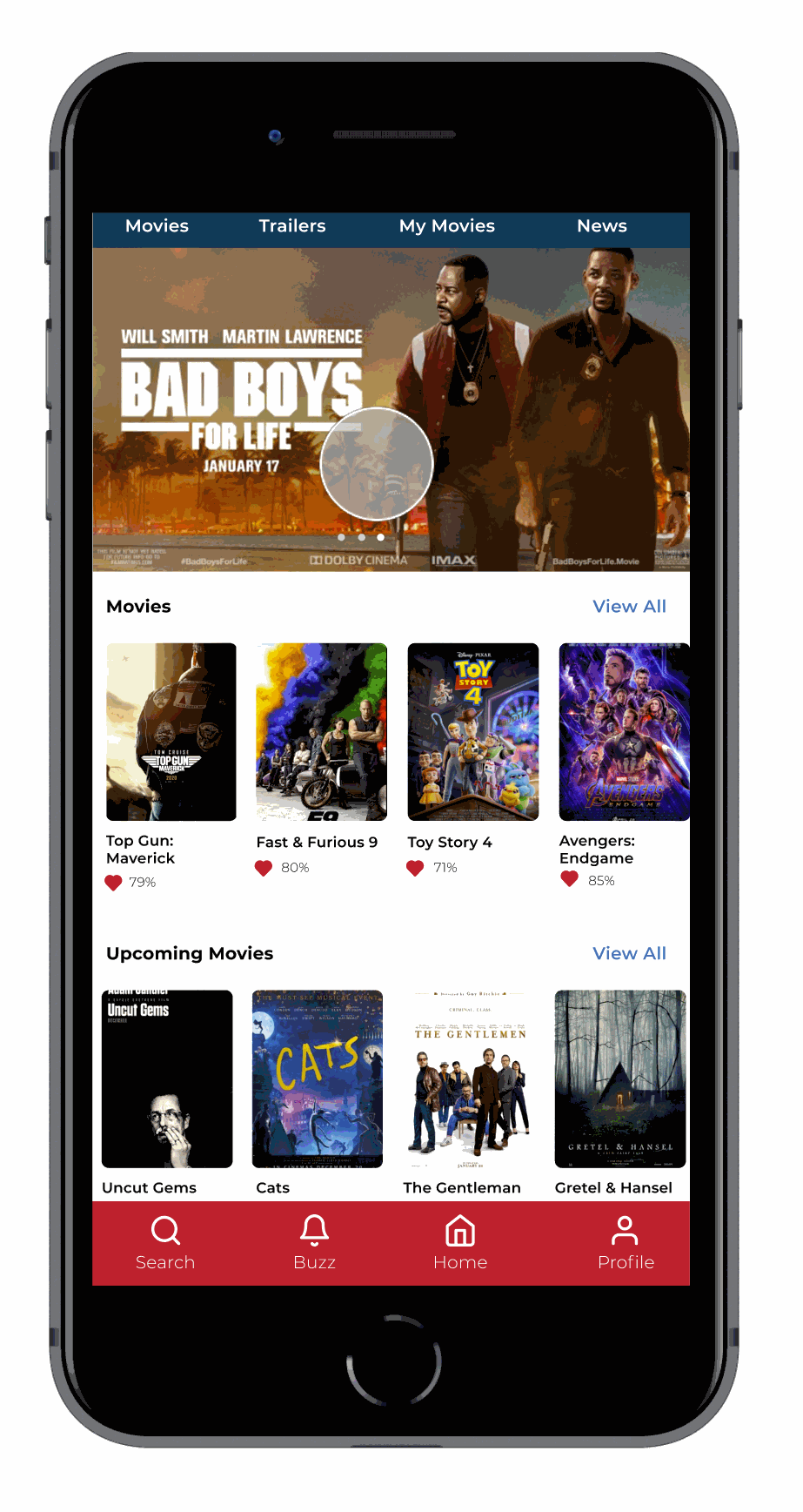
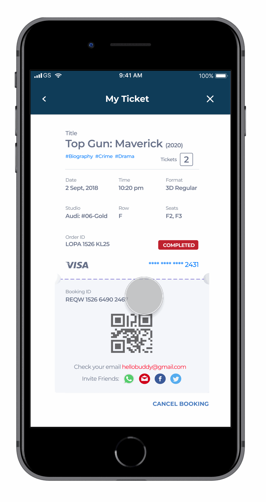
Ticket Booking Process - now with Seat Selection!
Not being able to select a seat was extremely frustrating for people. This has now changed. Users can now find new movies with favorable reviews, select their seat, and use a secure payment method, and book their ticket.
Cancelling Should Never Be a Hassle
Even though this was for an MVP app, it was important to ensure customers always felt their data and money was in safe hands. Hence I kept a cancellation feature for them to get their money back if they do not wish to desire the movie anymore.
IMPACT
Results + Next Steps
I can't emphasize how empowering it was to create this in just a few months by myself. I learned so much about user research. I’m thankful to have had 35 people participate in my research giving me a considerable amount of data to sift through to find great key insights.
I’m now excited to continue building on this, by exploring how to use conditional logic, to make ticket purchasing even more natural for the user. Overall this was a great experience and it taught me to always test as much as you can so you can verify your assumptions as a UX/UI Designer.
"I'm very excited about what you brought to the table. Great visual, user friendly, smooth and stylish application."
- Usability Testing Participant
Feedback on the design? Want to chat over coffee about movies or mobile apps? Find me on LinkedIn.